
Adventure Times is an app startup that curates the best adventure spots all over the US. My role was to design and develop a CMS blog for promotional interviews, stories, and adventure articles.

There are not that many competitors to what Adventure Times does, but the ones that do exist all have one thing in common: Beautiful photography is not really a focus. What really makes Adventure Times stand out from competitors is the focus on beautiful photography, which directly connects with a very specific audience who love exploring the outdoors and are very keen to beautiful aesthetics. With the recent boom of adventure photography on Instagram, people have high expectations when they think about the world of adventure.
The two main demographics are adventure enthusiasts and outdoor photographers. The adventure enthusiasts will be some of our main users, and the outdoor photographers will play a major part in the curation of photography and spot locations within the app, as they are constantly searching for new adventure spots to shoot photos at and know where the "secret spots" are. Closely collaborating with photographers has been massively important to Adventure Times. One of the biggest assets to the branding and marketing of Adventure Times has been seeking out photographers on Instagram who share the same type of adventure aesthetic that we are going for, and having them contribute to our Instagram account. Creating an adventure blog where these photographers can express themselves creatively and show off their photography and stories will help us further develop a stronger relationship with photographers, which will in return help us be able to accomplish the very difficult challenge of the Adventure Times app using hand selected photos for our adventure locations, rather than having iPhone photos being uploaded by users.
The goal for this CMS blog project was to create a platform where we can push out stories, interviews, and travel posts as part of a marketing effort before releasing the iOS and Web App. We also wanted to drive SEO to create a way for people who are not familiar with the brand to find us via Google search.
Since the majority of traffic coming to the blog will be from social media posts and email blasts, the mobile version of the site was very important.
.png)
One of the first things I wanted to do with the top hero section was to make the posts extremely immersive without hiding them in a traditional carousel. My solution was to create a simple 3-photo layout with the titles and descriptions hidden, but viewable on hover.
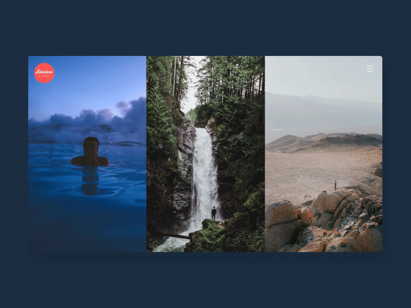
For the mobile version, I cut out the descriptions and made the post titles viewable.
.jpg)
We wanted to do something unique for the hamburger menu, instead of having the typical boring 3 line hamburger menu. We came up with a couple of different ideas, but they were a bit too complex. We had some small wave icons floating around in the app's UI style guide, and thought it would be cool to make the waves into a hamburger menu.

Most blogs don't provide many options for photo's to be laid out in unique ways other than all of the text and photos being contained within a set max-width, and laid on vertically with text, photo, text, photo, etc. We wanted to create modules that allow for photos and text to be laid out in more immersive ways each time they are displayed in a blog post.
